Skip to Main Content
Talk Beginner

The Loneliest Practice Room: Designing AI EdTech for Students Who've Never Spoken English Out Loud

Proposal status is Rejected
Session Description

Problem / Challenge

We built an AI tool to teach spoken English to ITI and Polytechnic students across India. But the hardest problem we had to design for wasn't the AI. It was a shamewas shame.

In most Indian classrooms, speaking English out loud is something students get mocked for not speaking it properly, sometimes even by teachers who were never trained to teach it themselves. During field research in Mysore in early 2026, I asked an ITI student a simple question: "Do you speak English in class?" His answer stuck with me: "No, other students might laugh at me because I don't speak it well, so I never speak it in class, not even with my teachers, because they also teach in the local language. Sometimes I practice at home, alone."

That one answer reframed the entire design problem for us with further validation. We weren't just designing a language-learning app. We were designing a safe space to fail out loud, for someone who'd never had one. And on top of that, every student we were designing for was different: different state, different regional/native language, different relationship with a smartphone, often coming from rural backgrounds with limited digital literacy. How do you design one tool that works for all of that?


Key Takeaways
  1. Designing language as an anti-shame mechanism: We rewrote our UX copy using principles of non-violent communication, avoiding words like "wrong" or "try again" that could feel like judgment, and instead framing mistakes as part of practice, not failure.

  2. Making practice feel like play, not a test: We designed exercises to feel interactive and game-like rather than exam-like, because for a student who already associates spoken English with public embarrassment, anything that feels like a test shuts them down before they even try. Even small details like font choice mattered. We used a rounded, friendly typeface throughout, because the visual tone sets the emotional register of the app before a single word is read.

  3. Designing for a country, not a demo: To train our model, we collected speech data from every district in India, a massive, deliberate exercise to make sure the tool could understand the range of accents and ways of speaking English across the country. Designing for "diversity" stopped being an abstract principle and became a concrete constraint on everything from the AI model to the UI.

  4. Multilingual where it helps, English where it matters: We made parts of the product multilingual, specifically the technical or instructional bits, to reduce friction where English isn't the point. But we kept the learning content itself in English, and leveled it, so students start where they actually are, with content mapped to the ITI employability curriculum rather than a generic syllabus.

  5. The tension between product polish and field reality: What gets designed carefully in Figma doesn't always survive contact with the realities students actually live in. This talk is as much about that friction as it is about the final product.

People should attend this talk because designing for shame, diversity, and varying digital literacy isn't a niche problem. It's the default condition for building anything for India at scale, and these are concrete, transferable design patterns, not abstract theory.


References

Session Categories

Other

Which track are you applying for?

Open Design

Speakers

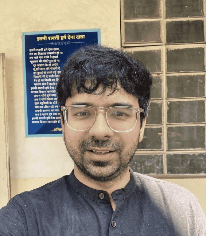
Vishad Tomar
Vishad Tomar Sr. UX Designer | Wadhwani AI

I'm a Senior UI/UX Designer at Wadhwani AI, working on products for education and workforce development in India. I've been the primary designer on SEAP (Spoken English Assessment and Practice), responsible user research, ethnographic research and for the full visual design language as well as individual activity screen interactions (listen-and-speak, fill-in-the-blank, match-the-following, pronunciation feedback), all the decisions are grounded in field research with students and teachers across the country.

The work has taken me from Figma to field visits, from building a design system to understanding why a student feels too ashamed to speak English in a classroom. What makes this worth sharing isn't that we solved the problem. It's that the problem kept resisting every solution we reached for, and that resistance taught us things no UX book covers.