Designing for IndiaFOSS 2026
Collection of experiences, observations, and learnings from managing and contributing to the design of IndiaFOSS 2026.
I’ve been involved in the design works for IndiaFOSS for the last four years. Every year, as the conference grows both in scale and ambition, the designs had to adapt and grow along with it.
This year we had around 8-10 volunteers contributing to the design work for IndiaFOSS. This is a collection of my experiences, observations, and learnings from managing and contributing to the design of IndiaFOSS 2026.
It starts much before the conference
The design work for IndiaFOSS usually begins around seven months before the actual event, with the first announcement post and a makeshift webpage.
From there, things gradually start taking shape. The website gets built out with more information, while decks, devrooms, pre-events, calls for proposals, and social media campaigns start coming together in parallel.
The designs evolve every year with better UX, more colours, new visual directions, more devrooms, and more content to communicate. There are always things that could have been done better, and that is part of the process. Some imperfections are only discovered once people actually use what we’ve built. Those become lessons for the next year.
The Visual language
The early stage is when we start thinking about the larger visual language ie., themes, patterns, illustrations, colours, and how everything can come together as one identity.
This is where having more design volunteers becomes valuable. It isn’t just about having more people to execute designs, it gives us more people to brainstorm with and explore different directions and build on each other’s ideas.
This year the initial visual direction was built around an interlocking pattern that complemented the IndiaFOSS logo.
If you want to go deep on the idea: an interconnected ecosystem of individual pieces coming together, connecting with one another, and forming something larger. which can relate to the FOSS ecosystem with communities and people coming together contributing and building collectively.
Devrooms get their own identity
Devrooms have become an important part of IndiaFOSS. This year, we had 8 fully packed devrooms.
Last year, one of the recurring issues we heard from attendees was that devrooms were difficult to find and weren’t promoted enough. So this year, we decided to give them much more visibility.
But this time we decided to go for fully branding the devrooms, giving each one its own color and pattern. Ritika created a set of beautiful patterns that represented each devroom and helped distinguish them from one another.
The idea was to make devrooms easier to recognise across the website, social media, and eventually at the venue itself.
Social media: from announcements to 145+ sessions
Social media is one of the biggest ongoing design efforts throughout the months leading up to the event. In the early stages, the posts are mostly about calls for proposals for talks, devrooms, workshops, booths etc. As the event gets closer, the focus shifts towards ticket announcements, proposal reminders, devroom announcements, and eventually the individual sessions and speakers.
This year, we had around 145+ sessions and 160+ speakers, and every session went out as an individual social media post. Muneer and Amit built a tool to help generate the speaker posts, which made the process considerably easier. Muneer handled the styling and design system for talks across the different categories and tracks.
But there were still several manual steps involved, especially when it came to speaker images. The images used in the posts needed their backgrounds removed, the head positioned close to the centre, the empty space above the head reduced, and the final image cropped to a 1:1 ratio. Some images simply weren’t usable and had to be requested again from speakers.
It may sound like a small task, but doing this for more than 160 speakers becomes a significant amount of work. These tasks required a lot of hands and effort from Koushik, Ritam, Jyoti, Anvar, Arup, Shraavya
There was also an issue reported with AI being used to process some of the images, where the output altered the speaker’s facial features. (this has been addressed and will be corrected next year)
Beyond speaker posts, the entire team contributed to the social media designs throughout the conference cycle. And, of course, good copy makes good design work even better. Ashlesh, Ananya, and Sadhana contributed some great copy along the way.
Maintaining a consistent IndiaFOSS visual language was something I paid a lot of attention to. I regularly reviewed the designs and made necessary changes and refinements to ensure that, even with different people working on different pieces, everything still felt like part of the same IndiaFOSS identity.
Finding our way around
Venue mapping continues to be one of those things we’re “still figuring out”. This year, however, the mapping and directions were significantly better than last year.
Shree Kumar created an entire map of the NIMHANS Convention Centre to scale. Ritika then built a version of that map with important locations marked out. We also worked on improving physical wayfinding with direction boards, clearer signage, and signs placed outside individual halls and rooms. There were still a few hiccups, but each of them is useful feedback for the next iteration.
James also built an AI-generated offline-first IndiaFOSS conference companion app that brought together the venue map, schedule and a few other features. I think there is a lot of potential here for next year. It’s already open to contributions and feedback.
More on how we went with signages:
The signage system this year was largely shaped by feedback from the previous edition. Some of the recurring issues were:
- People couldn’t easily find devrooms.
- Audi 3 felt too remote and difficult to locate.
- The internal route to the Food Area was closed, but the alternative route was less obvious
To understand the venue better, Shree, Ritika, and I visited the venue a couple of times and took a lot of photos and videos. We then mapped out the different points where signage would actually be useful.
We broadly divided them into three categories:
- Wayfinding signage: helps people understand which direction to go.
- Location signage: clearly identifying halls, rooms, and other spaces.
- Maps: giving people an overall view of the venue and helping them understand where they were.
Every hall and room were marked on the maps with clear signage placed outside of each one.(There was a confusing part that we changed Audi to Hall, this we will revert back next year)
Wayfinding signs were placed immediately after the entrance and also 2 other spots where people needed guidance towards specific areas.
The food area was clearly marked on the maps and more people used the exterior route.
There were a few practical constraints we had to work around:
- The signs cannot be stuck onto painted walls.
- The setup needed to be affordable and reusable.
- The signs had to be elevated enough to be clearly visible and accessible to people.
- They needed to be strong and rigid enough without falling or getting blown over.
The solution we came up with was a standing tripod with holders that could support signboards up to around six feet tall. The solution we came up with was a standing tripod with holders that could support signboards up to around six feet tall.
For the actual boards, we printed the designs on wallpaper sheets and pasted them onto 5mm foam boards, sized 2×4ft.
This overall modularity made it easy to replace the printed sheet whenever we needed a different piece of information like a schedule, a devroom poster, or another directional sign.
This full setup costs just below Rs.2000 per signage unit. In this we would only need to replace a 400rs printed sheet if needed to reuse in future events.
(Unfortunately, we couldn’t get few of the tripods delivered on time, so we had to switch to pinning boards at the venue)
Merch: design becomes something you can wear
Merch is always something we discuss collectively, both among the design volunteers and the wider team.
This year, instead of asking everyone to work towards one pre-defined direction, volunteers were encouraged to explore their own ideas. That gave us a nice variety of visual directions to choose from.
But good merch isn’t always about the visual design, some creative copy is what makes it more special. For this year, the line we eventually went with was:
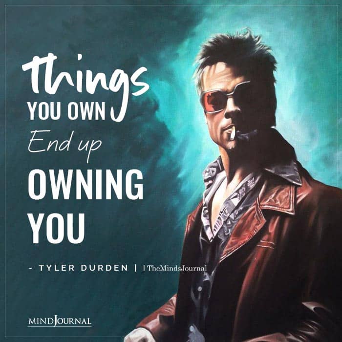
“What we build, builds us.”
Thanks to Ritika, James and Ashlesh for helping bring that one together. (and Tyler Durden)
Ritika also came up with the idea and design for:
“Give me a terminal & I shall move the world.”
which made its way onto the hoodies.
There were plenty of other cool merch ideas contributed by Ritam, Jyoti, Anvar, Koushik, and Arup.
Selvaganesh also created some really cool sticker designs that, unfortunately, we couldn’t get printed this time. He also put together a great promo video for the event.
I have seen Rahul replace his 3rd water bottle after covering it almost entirely with stickers. So I suspect that may have been his main motive to pitch the idea for a sticker bomb (a collage made from logos of different FOSS communities and projects.) Unfortunately, we had to drop that idea because of time and task constraints. Maybe next year.
I also want to mention Aditi and Mathura from PaperCraneLab. They set up a participant activity where people could pick a sticker, customise it, and add it to a long roll of paper. Over time, the roll turned into a visual record of everyone’s participation, almost like a live, collaborative data visualisation. It was a simple but really engaging way for participants to leave their mark on the event.
Growing the design team
One of the biggest changes this year was the size of the design team. Last year, we had 4 people. Before that it was not more than 2 or 3. This year, around 8-10 volunteers contributed, with a majority of them being beginner designers.
That made delegation a critical part of the process. It meant learning how to communicate clearly, assign tasks based on people’s strengths, review work, and give feedback while still giving everyone enough room to explore.
It worked both ways. I had to be open to ideas different from mine, and the volunteers also had to sometimes let go of ideas that didn’t fit the larger visual direction. Finding that balance between creative freedom and consistency is something I’m still learning, and there’s definitely a lot we can improve on next year.
What comes next
IndiaFOSS keeps getting bigger, and that naturally means the design problem keeps getting bigger too. There are still plenty of things we haven’t perfected; better venue navigation, more efficient content production, smoother volunteer workflows, better accessibility and reducing some of the repetitive manual work involved in preparing assets.
But that is also what makes working on IndiaFOSS interesting. Every year gives us a new set of problems to solve. And every year, the community grows a little bigger, the team gets a little stronger, and the design gets a little better.
A huge thanks to everyone who contributed this year. Not just to the visual design, but to the countless small tasks that make the whole thing work. And a special thanks to Vrinda and Siddharth for smoothly managing the volunteers and following up on every little bit of the event.
IndiaFOSS is not designed by one person. It is designed by everyone who contributes to making it happen. Reach out to us at indiafoss@fossunited.org or me at jeswin@fossunited.org if you are interested in volunteering for designs for IndiaFOSS or for the wider community.
No comments yet. Login to start a new discussion Start a new discussion